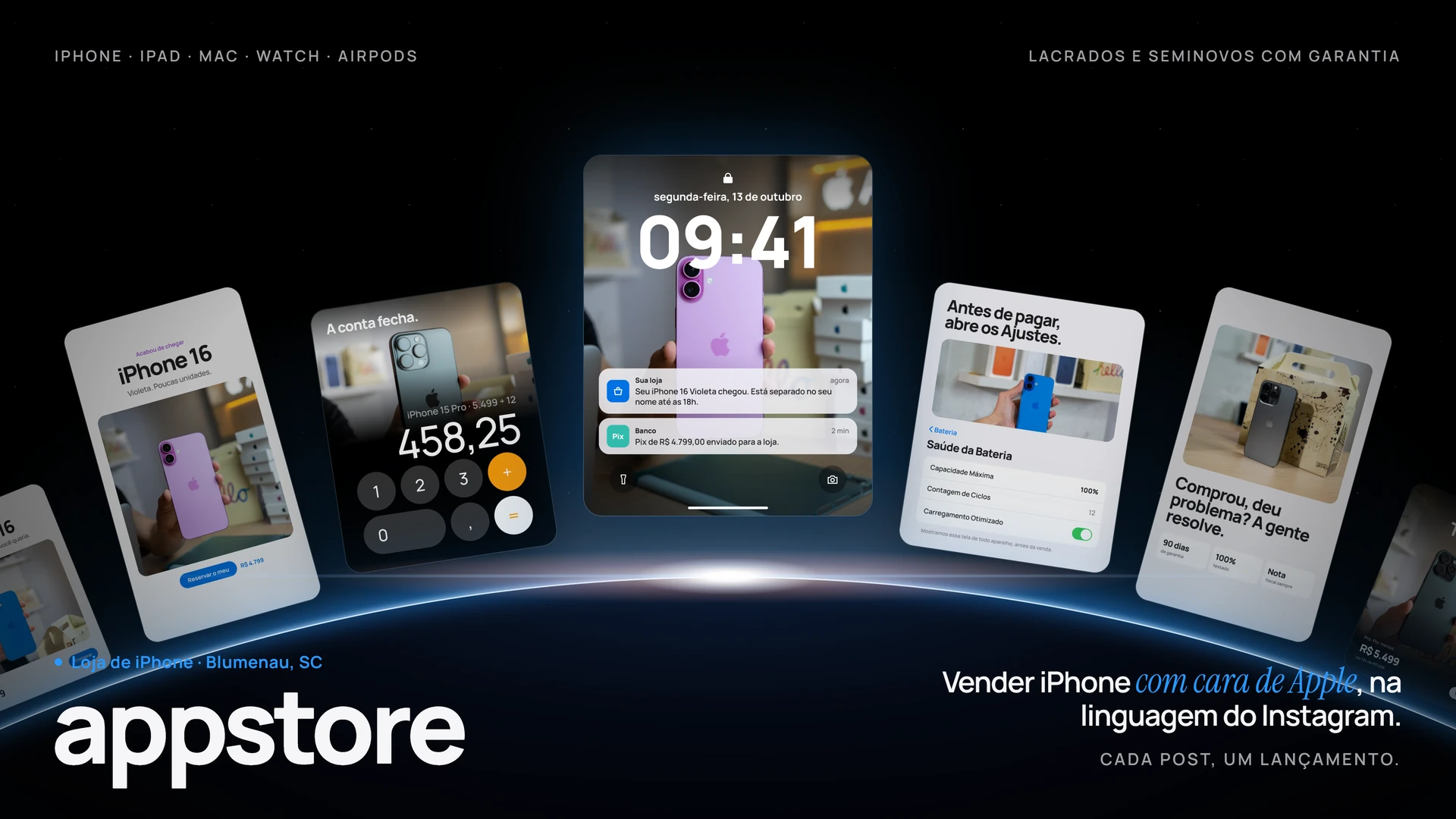
What we did
- A product standard: clean background, honest shadow and breathing room, the way people already expect to see an iPhone.
- Price posts that are not flyers: a big number with silence around it.
- Stock and payment stories, on the day the model lands.
- Ad creative for people searching a model and a price nearby.
The idea
Phone shops almost always communicate with urgency: red background, arrows, too many words. That works for a case on sale and works against anyone selling a device worth thousands.
We flipped it: fewer elements, more white, big product. The confidence to spend comes from the quiet, not the shouting.