What we did
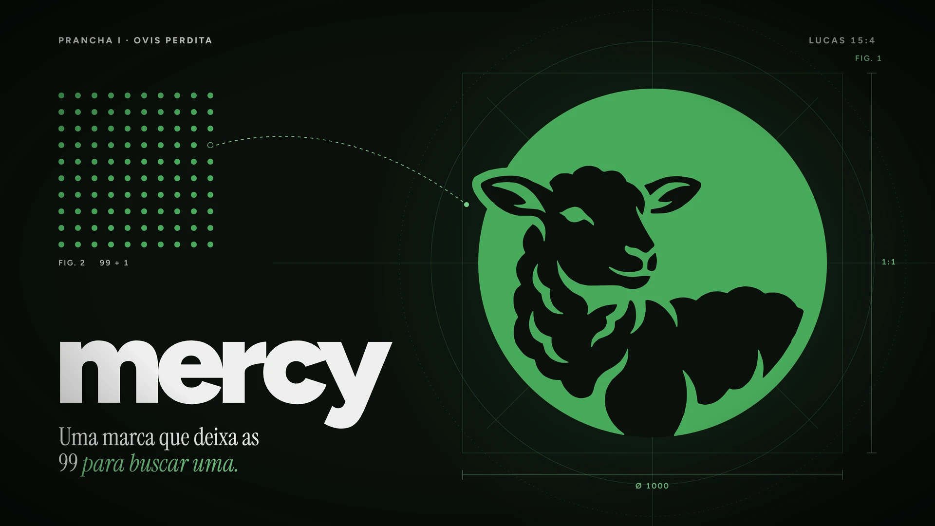
- Name and symbol: the lamb that is carried back, from leaving the ninety-nine to go after one.
- The whole visual system: color, type and the product’s tone of voice.
- Product interface designed alongside the brand, not after it.
- A site in Portuguese and English, with the demo inside the page itself.
The idea
The biggest decision was tone. Church management handles money, members and prayer requests in the same place. If the brand shouts, the pastor gets suspicious. So it speaks quietly: pasture green, a plain lamb and no effects.
The same identity runs the product and the communication, so whoever arrives through the site recognizes the screen they will use later.